

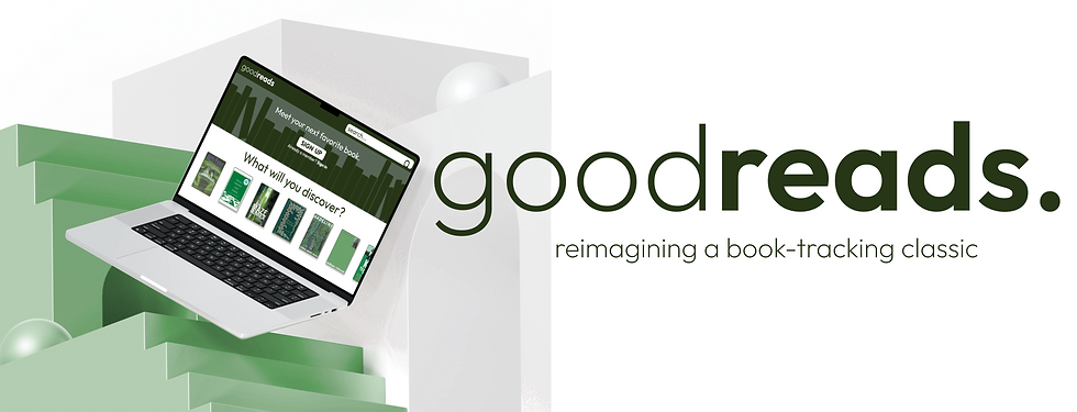
goodreads
goodreads redesign is a UX/UI overhaul project aimed at solving long-standing pain points in one of the most widely used book-tracking platforms. the concept reimagines Goodreads with streamlined navigation, tailored recommendations, and modern visuals—making reading, tracking, and sharing effortless for both casual readers and avid bookworms.
challenge
opportunity
for the design interactive club at uc davis, we were asked:
how do we redesign goodreads so it's more inviting and intuitive for new and experienced readers?
redesign goodreads into a modern, intuitive platform with streamlined tracking, personalized recommendations, and engaging—but not overwhelming—social features.
timeline
spring 2025
user experience design
user interface design
visual design
interaction design
disciplines
tools
figma
team
luke velasco
enoch deleon
andrew lee
research & inspiration
insights
research goals:
-
understand users' frustrations with the current goodreads interface, especially around usability and visual design
-
investigate how readers currently discover, track, and share books within goodreads
-
identify challenges faced by users when looking for books
-
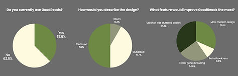
62.5% of people surveyed don't use goodreads as it is right now
-
~91% described the design as cluttered and outdated
-
35.1% said a cleaner design would help improve it the most
important improvements
-
Removed unnecessary options
-
GoodRead Choices
-
News & Interviews
-
-
Changed
-
Sign-up opinion
-
Added more quotes
-
Search buttons transfer to browse options
-
-
Changed the color themes
-
Light & Dark Green, Cream
-
final design
the final redesign transforms goodreads into a platform that feels intuitive, approachable, and motivating. readers can focus on what matters most—discovering, tracking, and enjoying books—without being bogged down by outdated systems.

takeaway
-
Building a design system upfront — with colors, typography, and components — streamlined the design process and kept everything consistent.
-
Thoughtful use of color and theme had a noticeable impact; the green tones we chose helped reduce visual fatigue while reinforcing the health-focused brand identity.
-
Making deliberate decisions about which elements to keep vs. cut was crucial — small choices ultimately shaped the clarity and usability of the final product.

user feedback
-
"the redesign is pretty, but i wish there was an option for high-contrast, earth tones are hard to see in bright light." - trish le
-
"it feels like goodreads in 2025. cleaner interface, easier to navigate, and actually fun to use now." - brenden barry
-
"i like how the new look feels peaceful, it feels more focused on the books." - joseph kimm